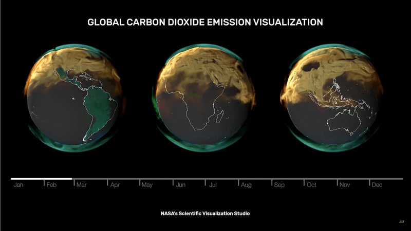
NASA’s Scientific Visualization Studio has released three powerful videos that show just how much carbon dioxide is added to the atmosphere each year, from what sources, and from where on the planet. And they show just how much fossil fuel burning by industrialized countries plays a role in the amount of greenhouse gases released into the air.
The visualizations show the carbon dioxide added to the Earth in 2021 as colorful smoke above the surface. In blue and green is the amount released by land ecosystems, plants and wild animals, and oceans. In red is the burning of biomass. And in orange is the release of fossil fuels. Flashing in green and blue are the places on the planet where carbon is absorbed: forests and oceans. The flashing rhythm depends on whether it's day or night, and on the season.
The work was based on data from NASA’s Orbiting Carbon Observatory, 2 (OCO-2) the most complete dataset of the concentration of atmospheric carbon dioxide across the planet. The views are obviously grim, particularly the emissions from highly industrialized regions, and large cities where cars are the main form of transport. In parts of the world with low population density (such as Australia and Africa), the globe stays pretty clear for months, but the emissions eventually spread.
Australia is an interesting case, given the country had at the time the highest coal consumption per capita. But being spread out across a vast continent that can absorb some of it makes it look almost clear. In other places, with higher densities of population or the presence of heavy industries, the picture is different, such as the Arabian peninsula or Russia.
The natural world is trying to keep up with us, but carbon sinks in the ocean and land can only take in about half of all the carbon dioxide we produce annually. The rest gets spread around the planet – which, by December 2021, looks like a smokey orange bauble.
The climate crisis is unfolding but the worst of it can be avoided by bold changes today from the world’s governments. The best day to act is today, the next best day is tomorrow.


